Recently, I completed a website accessibility review for a community-based organization with more than 100 public-facing web pages.
Like many organizations, they had invested significant time and effort into creating an attractive website with helpful content, programs, and resources. The website looked modern, was regularly updated, and provided valuable information to the community. However, accessibility reviews often reveal challenges that are invisible to most users.
Here are some of the most common issues I encountered.
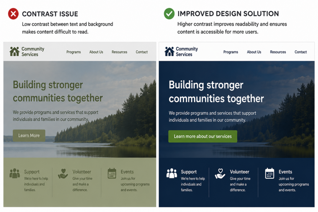
1. Colour Contrast Matters More Than You Think
Many websites use brand colours that look attractive but do not provide enough contrast between text and background colours.
This can make content difficult to read for people with low vision, colour blindness, or users viewing content on mobile devices in bright sunlight.
The good news? Most contrast issues can be resolved with minor colour adjustments while maintaining the organization’s brand identity—a big win for both accessibility and design.
2. Headings Help Everyone Navigate
Headings are not just visual design elements.
Screen reader users rely on headings to quickly understand page structure and navigate content efficiently.
Common issues include:
- Missing heading levels
- Multiple Heading 1s
- Skipped heading levels
- Text that looks like a heading but isn’t coded as one
A logical heading structure benefits all users and improves overall usability.
3. “Click Here” Doesn’t Tell Users Anything
Links such as “Click Here,” “Read More,” and “Learn More” may make sense visually, but they provide little context when read independently by assistive technology.
Descriptive links help users understand where they are going before activating the link. For example Instead of: ‘Learn More” , Consider: “Learn more about our services“.
4. Images Need Meaningful Alternative Text
Images that convey information should include alternative text that communicates the same purpose or message. Decorative images should be identified as decorative (artifacts) so they are ignored by screen readers and do not create unnecessary distractions during navigation.
Not every image needs a lengthy description, but every image should have a purpose.
5. Accessibility Is More Than a Checklist
Accessibility is often viewed as a compliance requirement, but at its core, accessibility is about usability. Clear navigation, readable text, meaningful links, responsive layouts, and accessible documents all contribute to a better experience for everyone.
Many accessibility improvements benefit:
- Older adults
- People with language barriers
- Mobile users
- People with temporary injuries
- Users with slower internet connections
- Individuals using assistive technology
Final Thoughts
One of the most encouraging findings from this review was that many accessibility issues could be addressed through practical design and content updates rather than a complete website redesign. That’s often welcome news for organizations working within limited budgets and timelines.
Accessibility is not about perfection. It is about identifying barriers and continuously improving the experience for all users. If you’re not sure where to start, a basic accessibility review can often uncover simple improvements that make a significant difference.
Need help assessing your website? Contact epubsupport to learn more about website accessibility reviews, accessibility testing, and practical remediation recommendations.